Project type: Professional
Services: Naming, branding, digital, packaging, illustration
Client: omni
Services: Naming, branding, digital, packaging, illustration
Client: omni
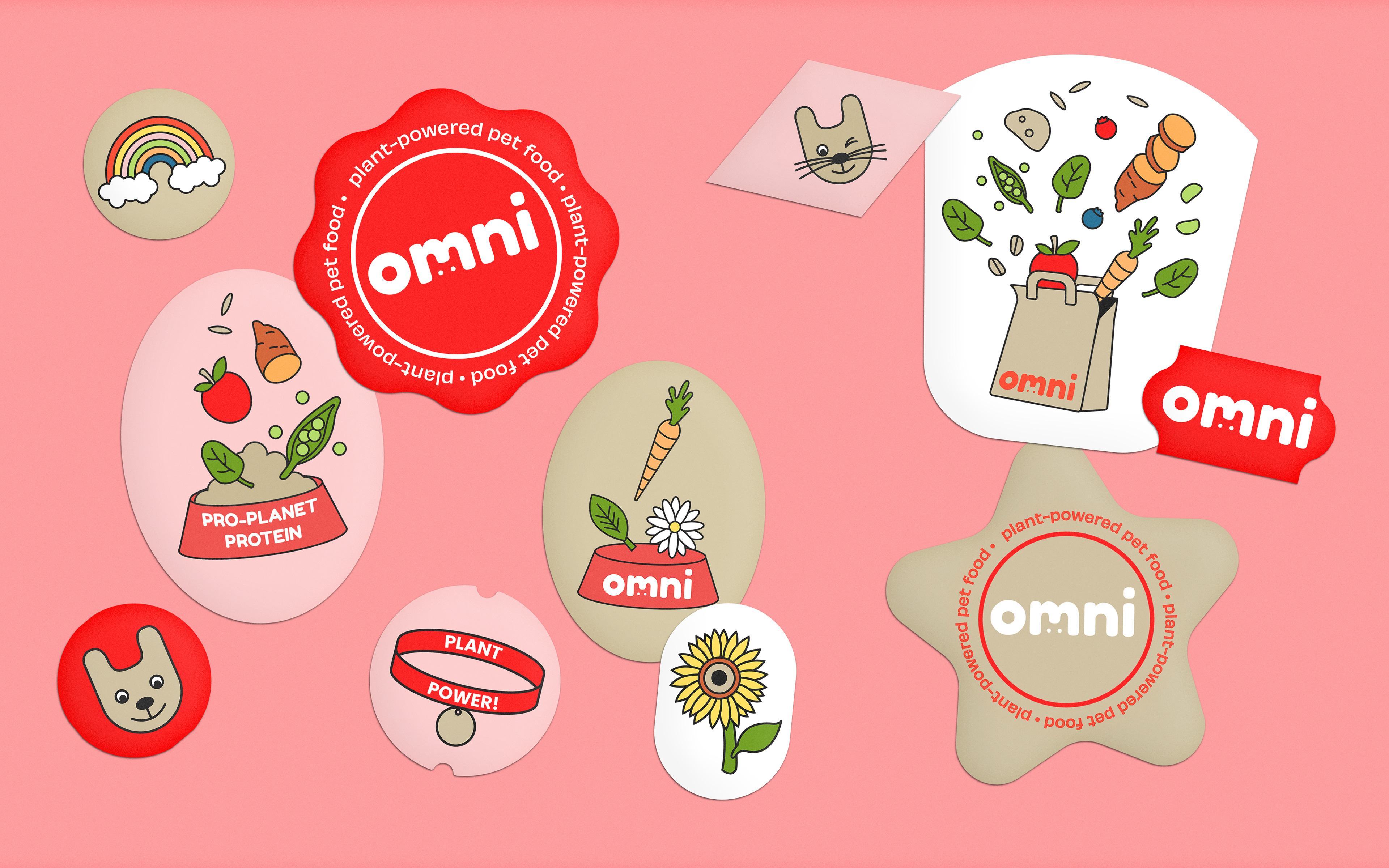
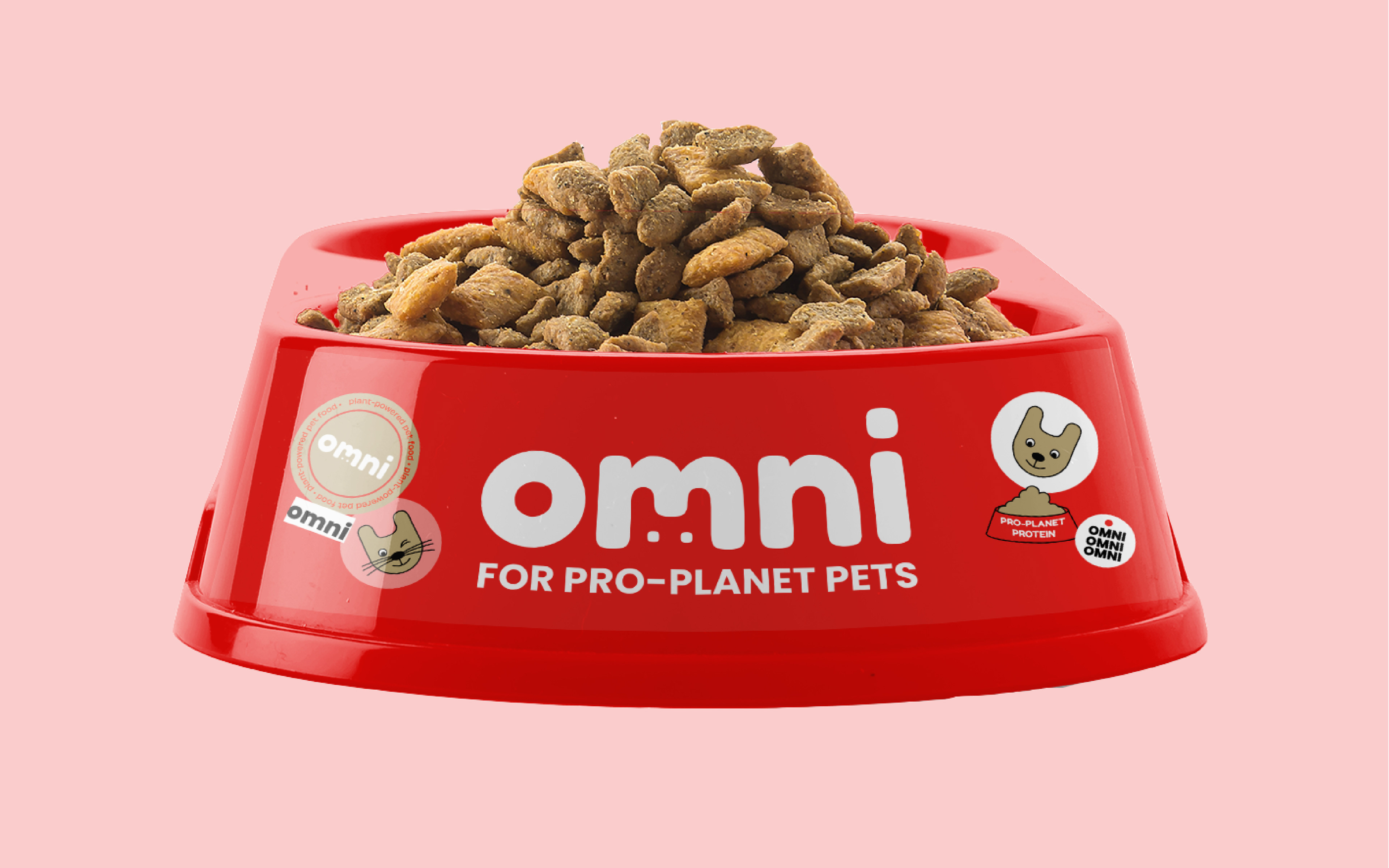
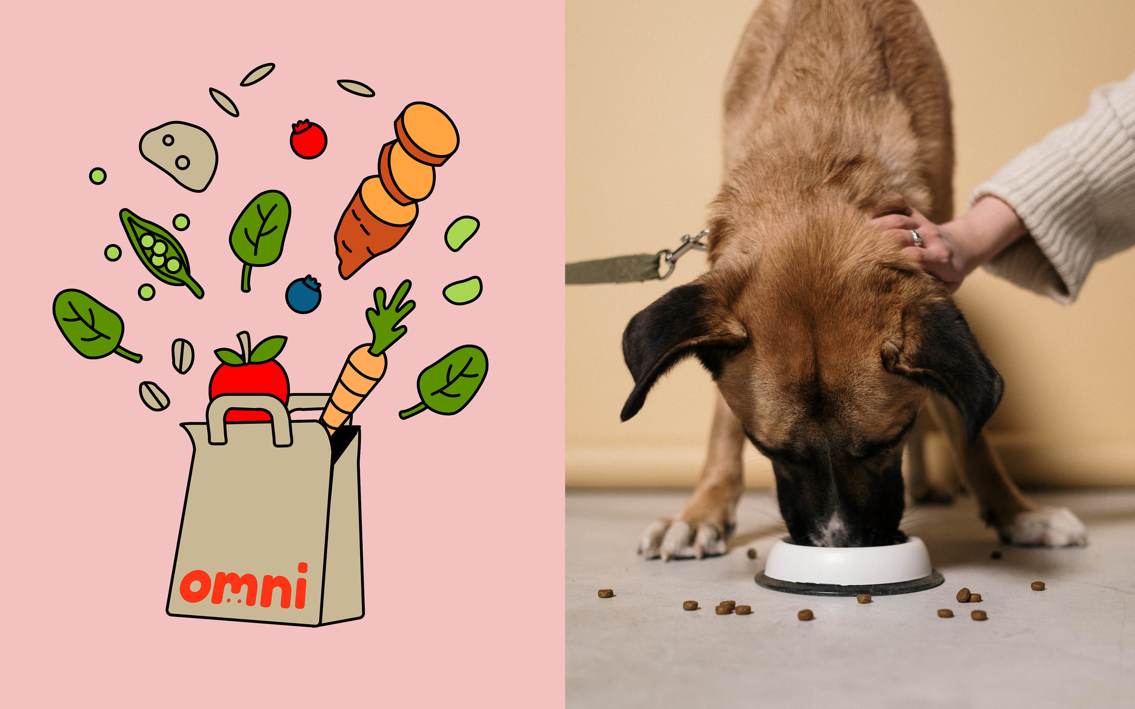
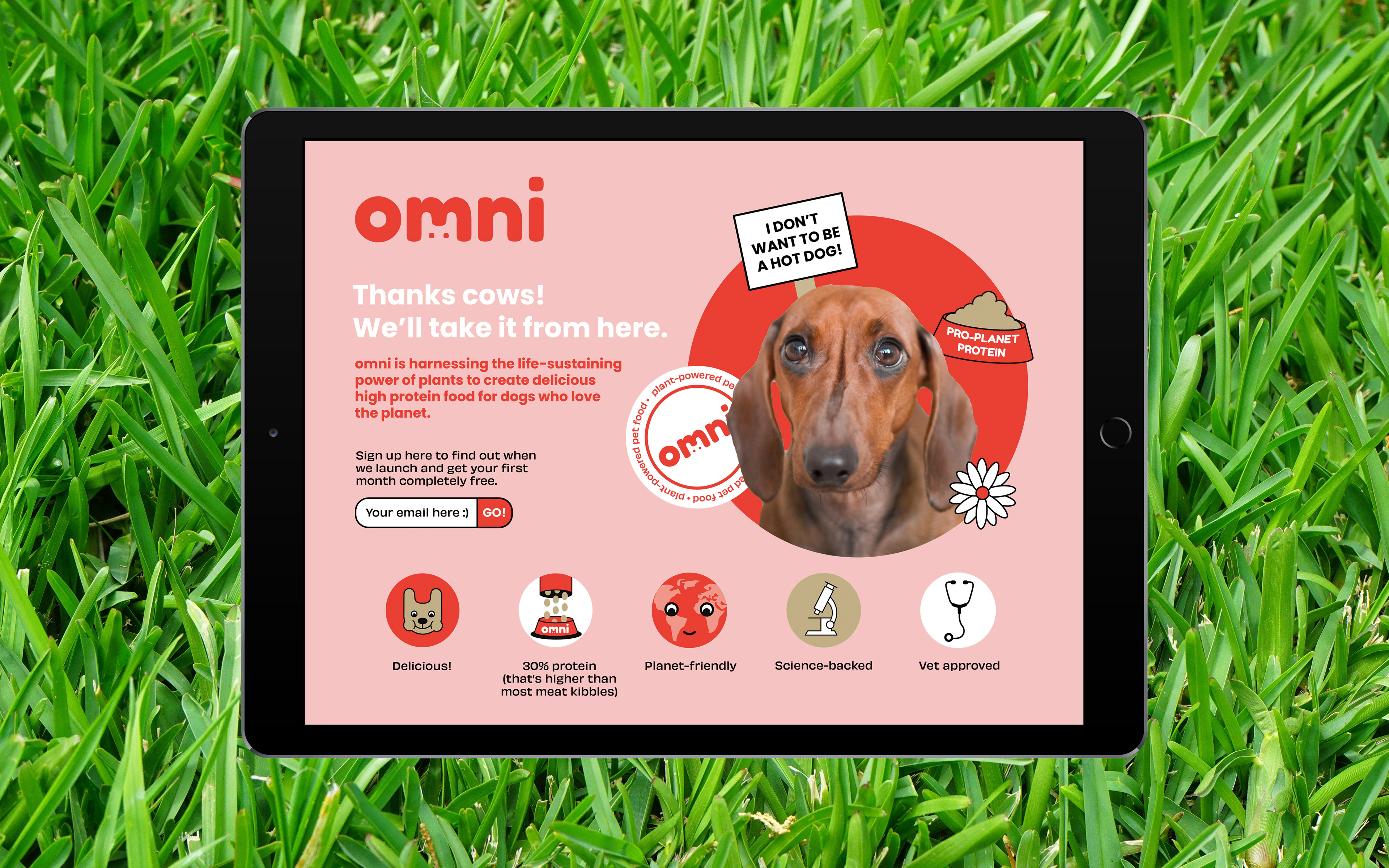
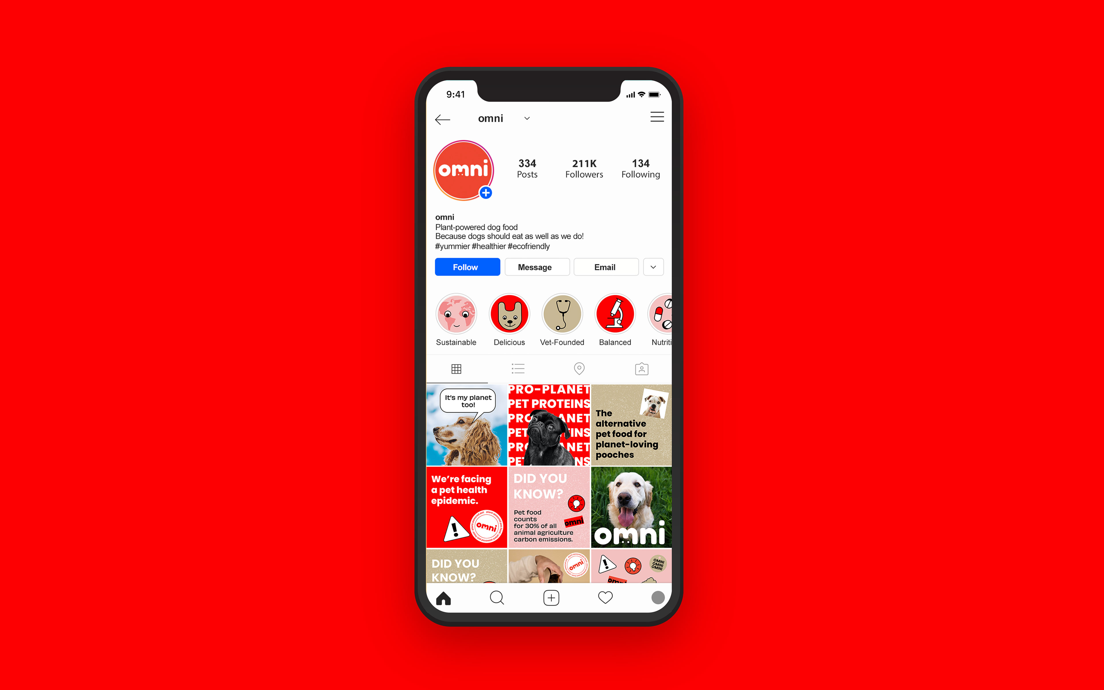
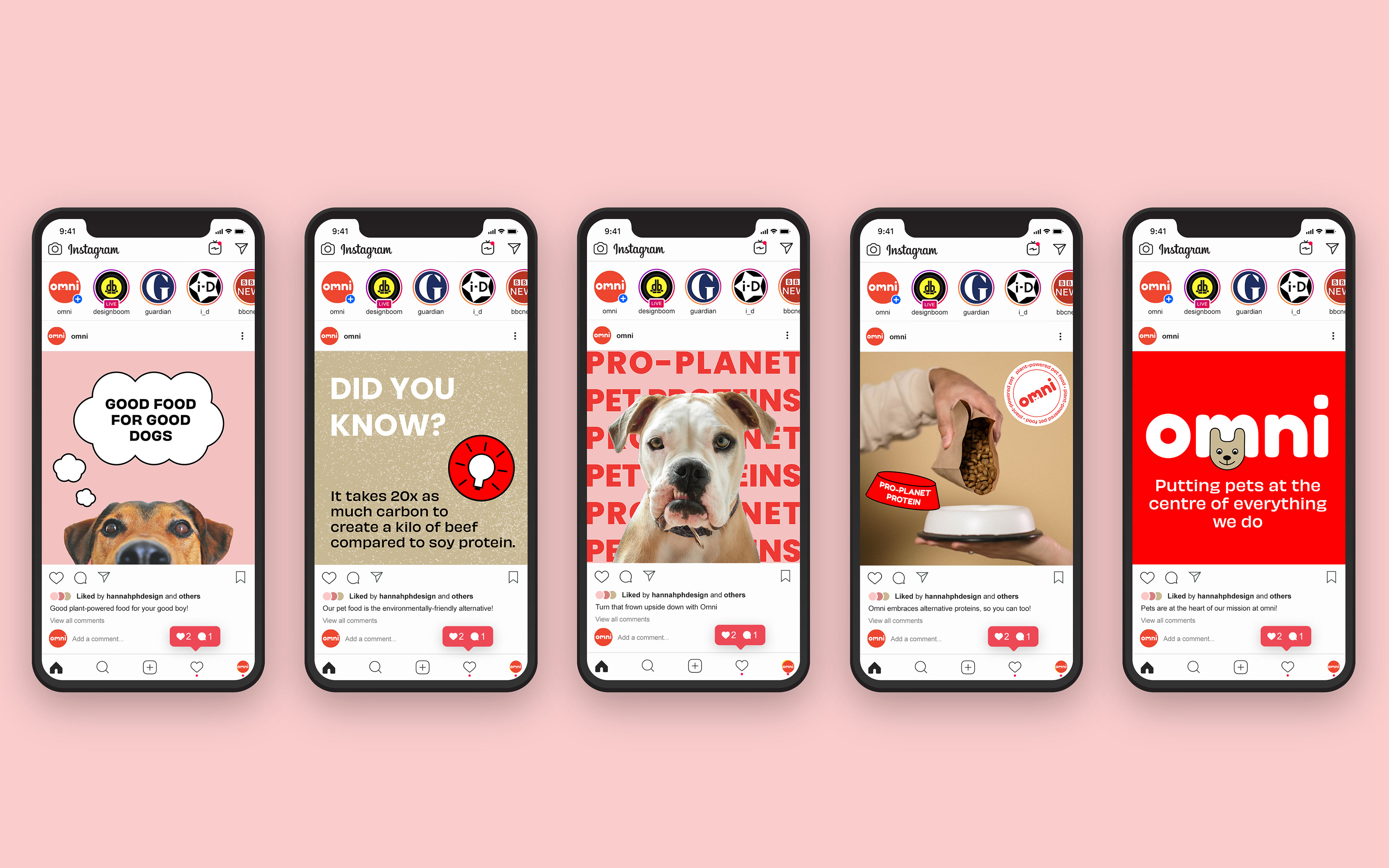
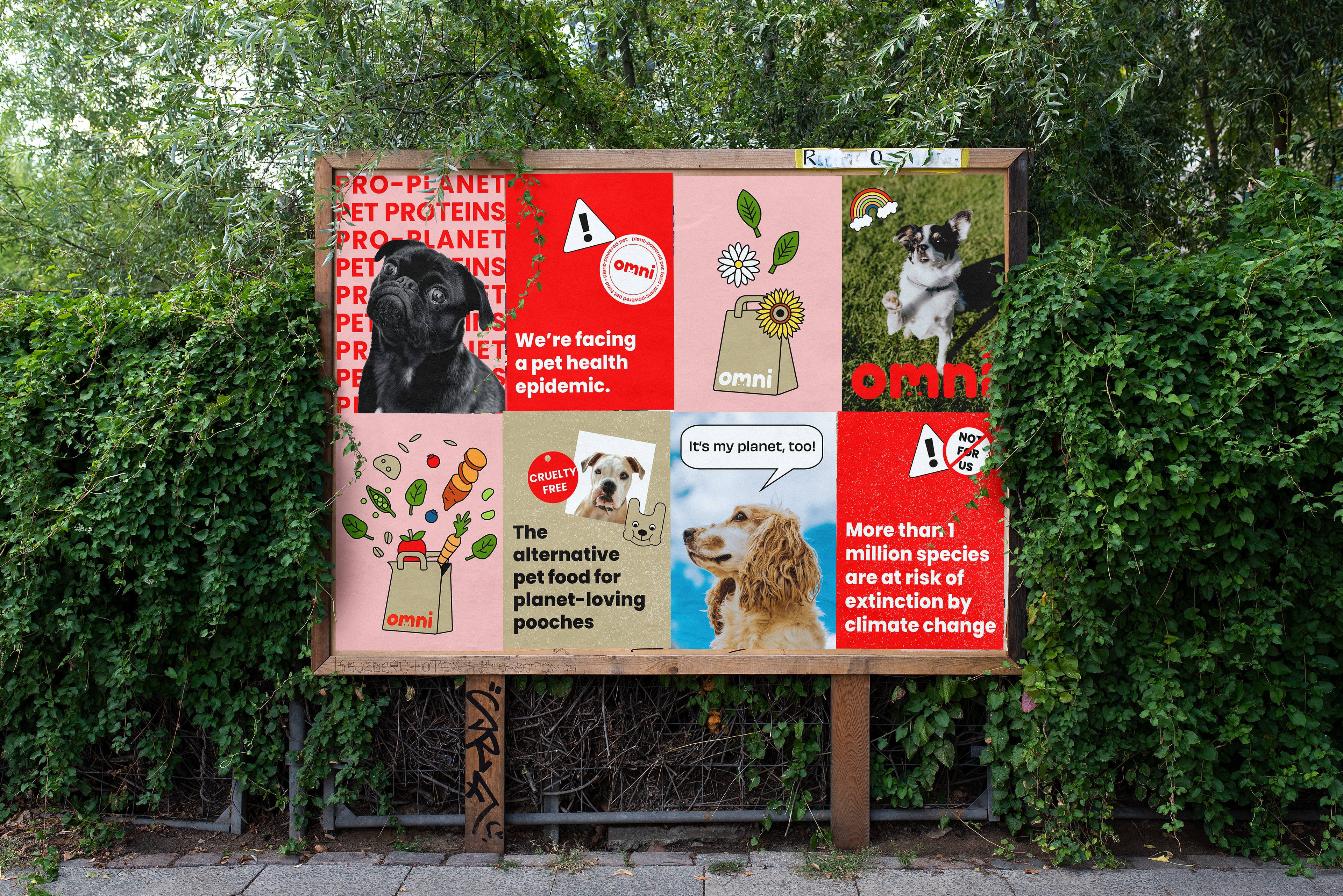
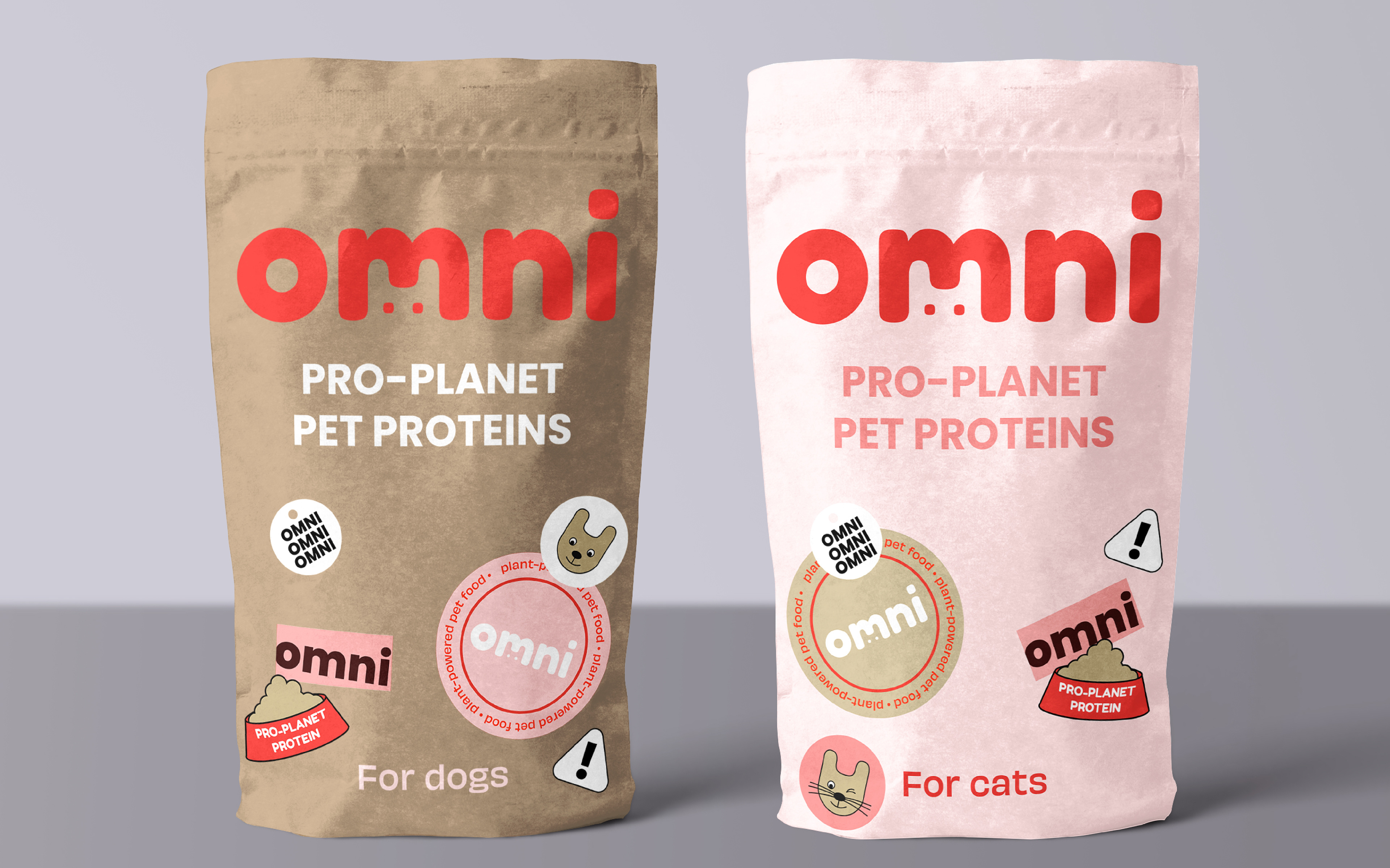
omni are an exciting new addition to the sustainable pet food space. Their aim is to harness the life-sustaining power of plants to create delicious high-protein food for dogs who love the planet. Founded by vets, informed by science and infused with love, they were looking for branding that set them apart from competitors and celebrated their values. I provided them with a suite of hand-drawn illustrations and a dynamic visual language that was then rolled out across web, packaging and social channels.
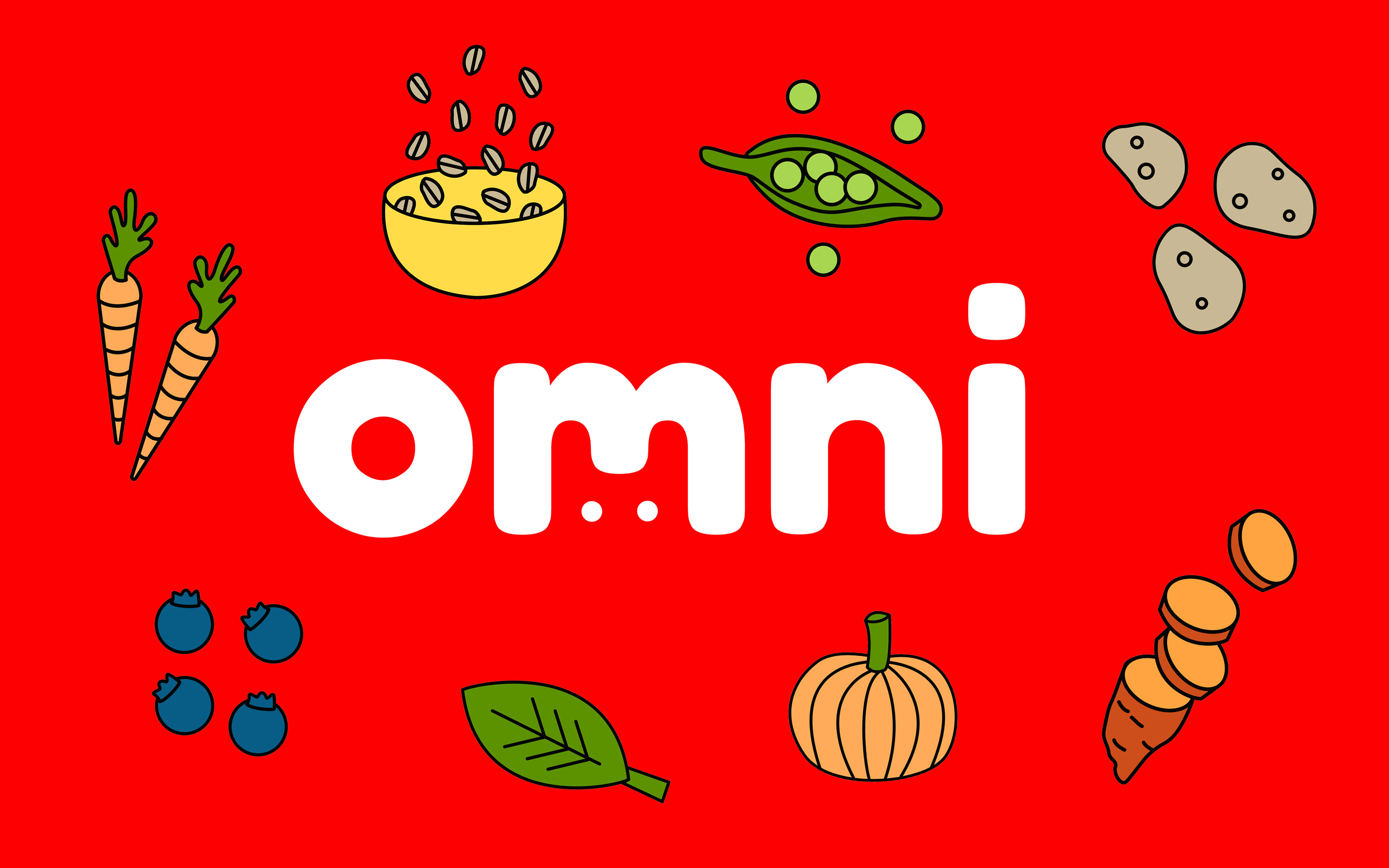
I created a bold, divergent and playful identity that set pets at the heart of both the logo and the brand. Selecting bright red as the hero colour was a conscious choice intended to differentiate omni from a market saturated with pastel greens, hemp-y browns and drab oranges. Red is a colour that is typically associated with meat – we chose to own this colour as it also communicates warnings (pertaining to the climate crisis) and symbolises passion and love, which informs every decision the brand makes.