Project type: Professional
Services: Brand Identity, Print Design, Typesetting
Client: Poetry London
Services: Brand Identity, Print Design, Typesetting
Client: Poetry London
Poetry London were looking for a complete brand overhaul to coincide with their 100th edition.
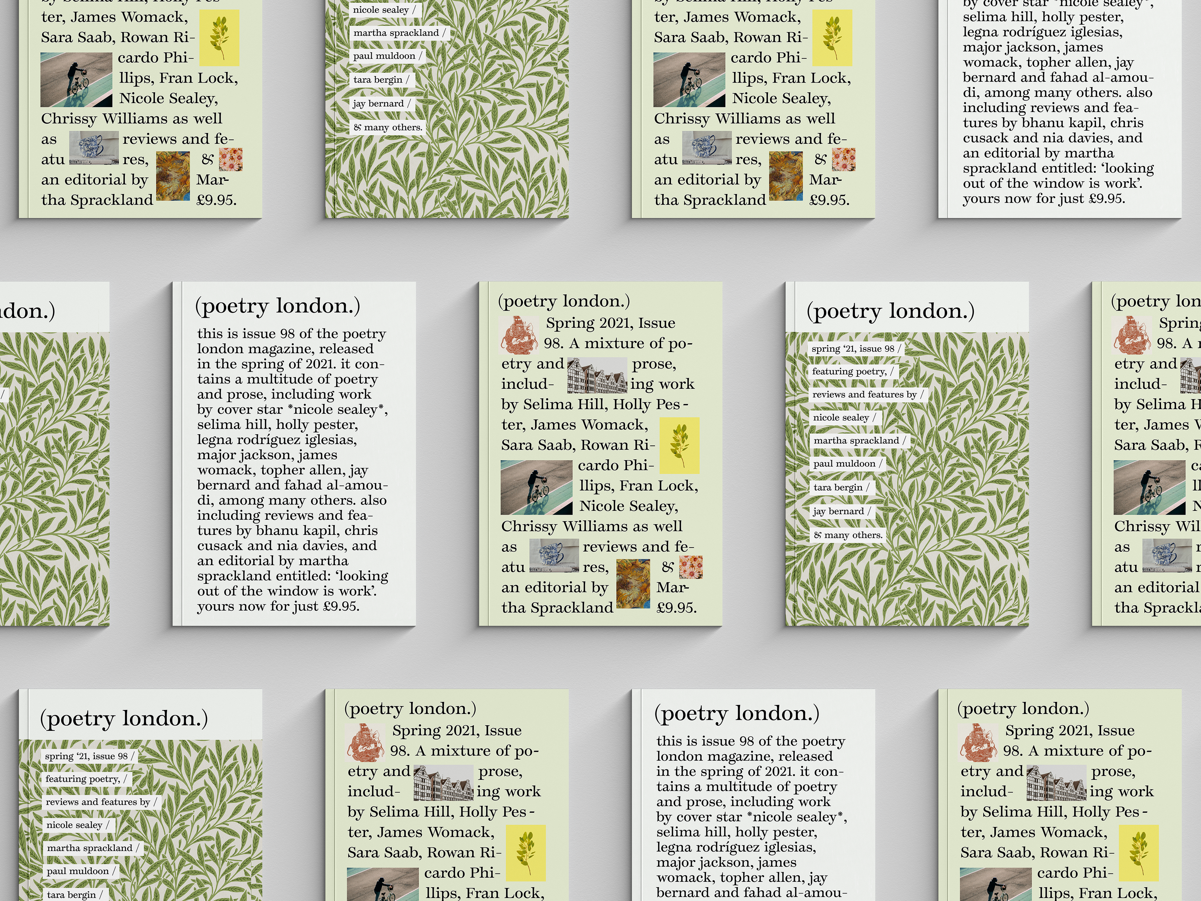
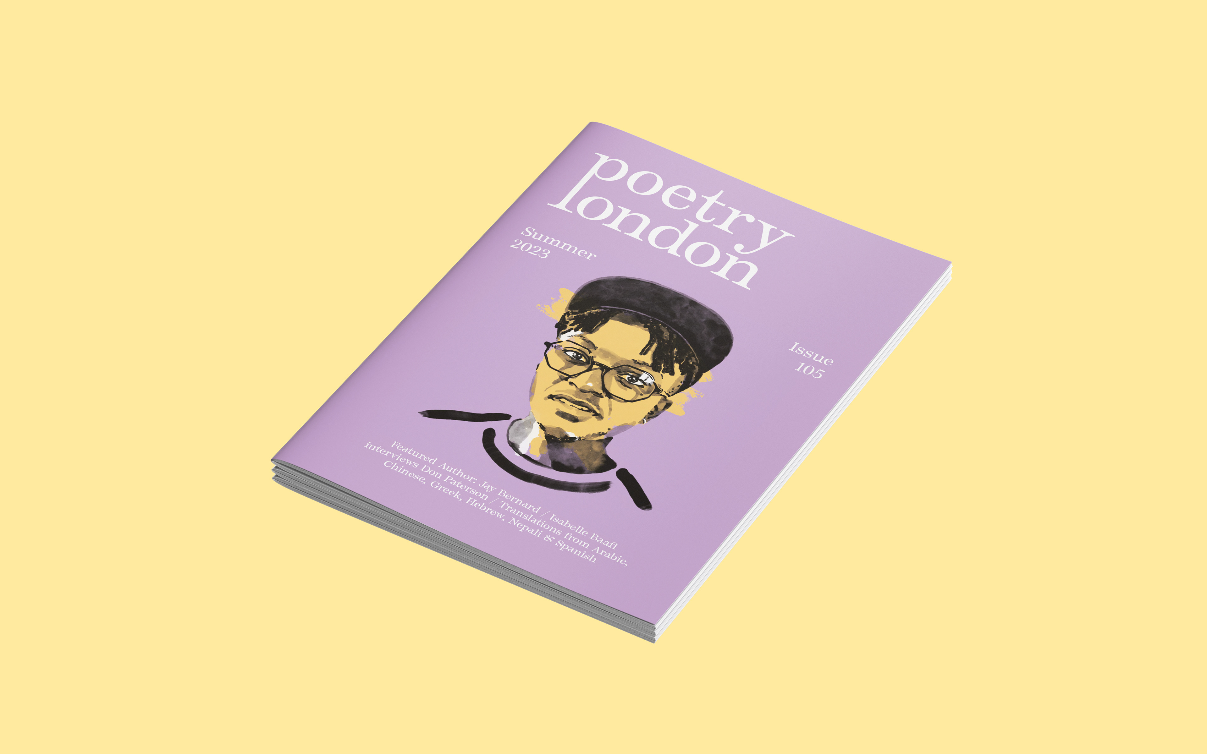
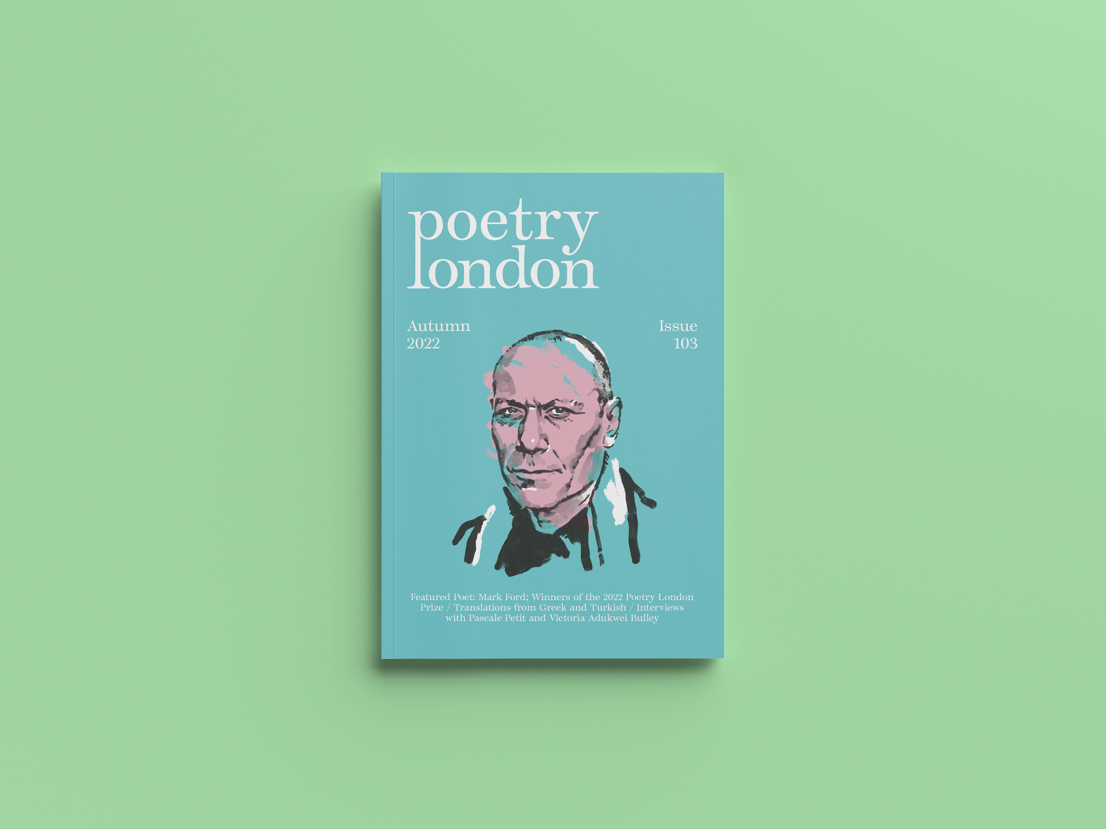
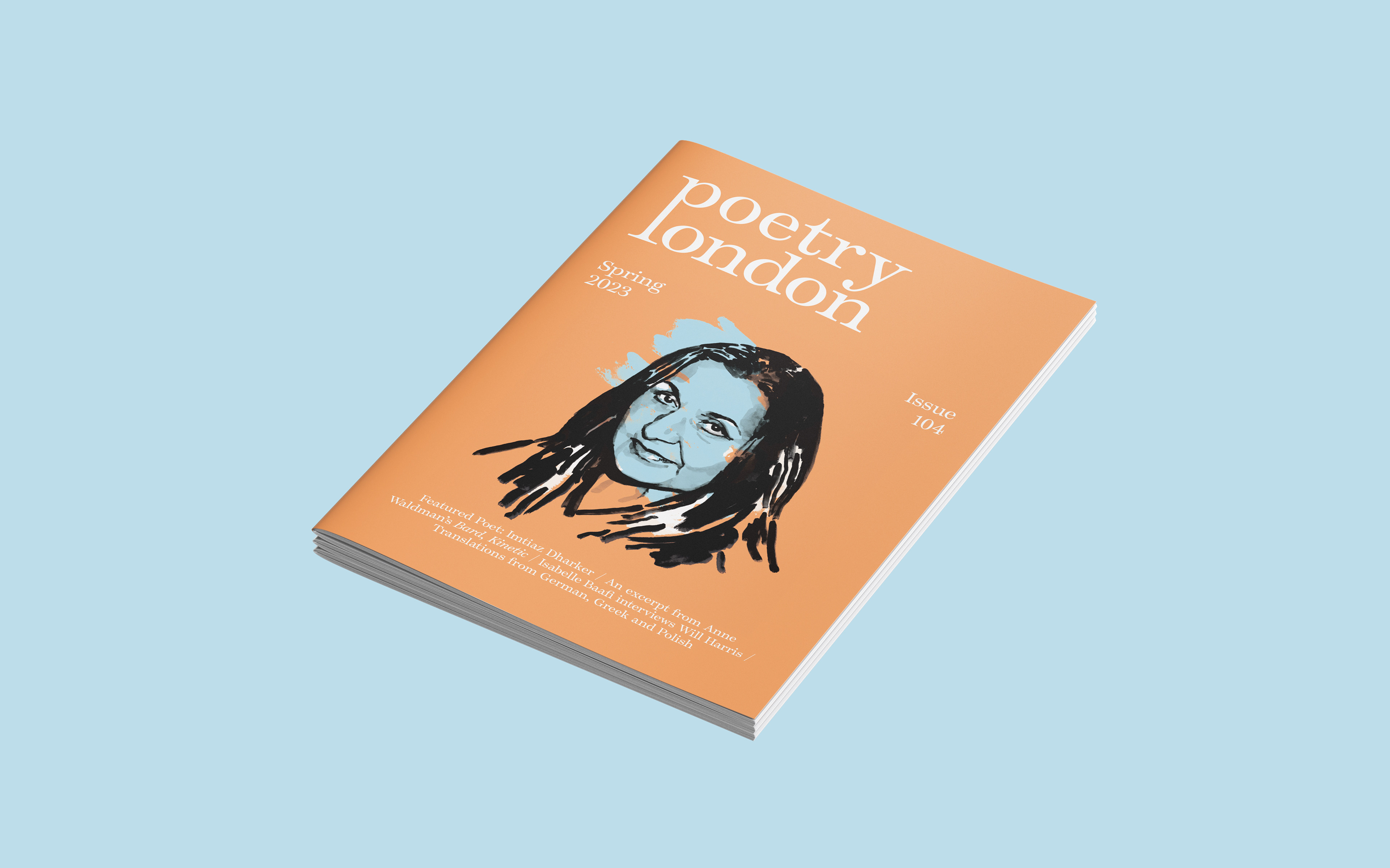
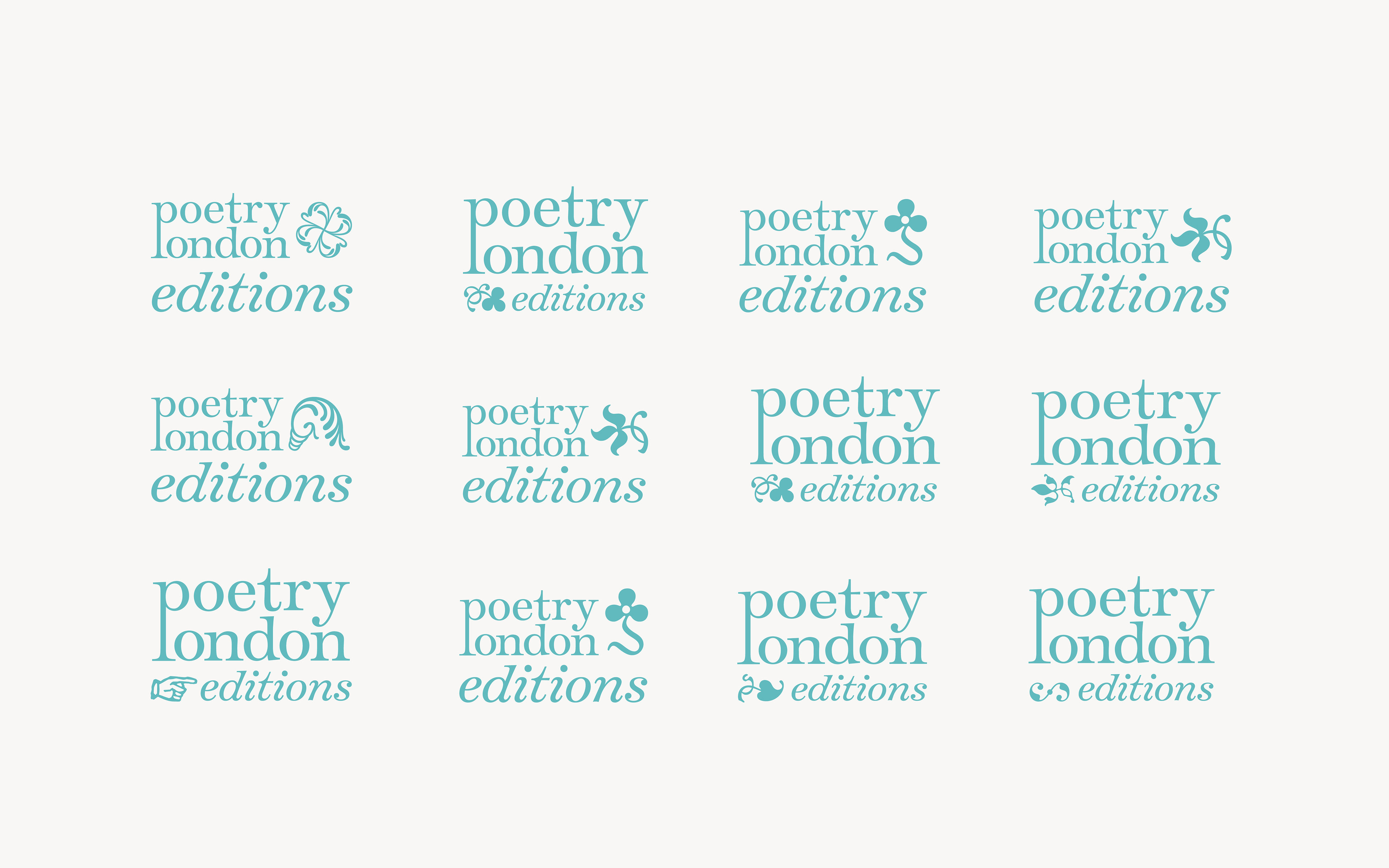
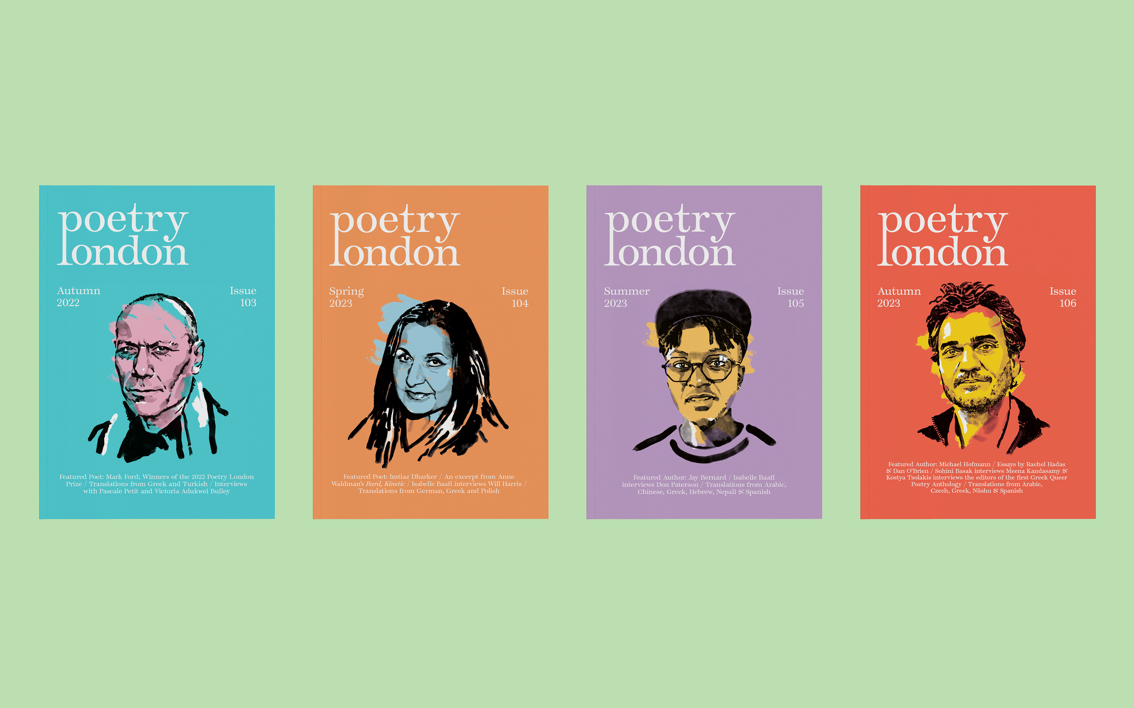
I was invited to pitch and won the client with a diverse proposition involving several distinct visual directions. My brief included developing a new logo, typeface, identity, cover design and interiors for both their print and digital quarterly magazines. I worked closely with the editorial team and commissioned illustrator Sam Kerr for the cover portraits, also working on the art direction and honing a distinct look for each poet's painting with Sam that was cohesive across the editions but had their own distinct characters.
I was invited to pitch and won the client with a diverse proposition involving several distinct visual directions. My brief included developing a new logo, typeface, identity, cover design and interiors for both their print and digital quarterly magazines. I worked closely with the editorial team and commissioned illustrator Sam Kerr for the cover portraits, also working on the art direction and honing a distinct look for each poet's painting with Sam that was cohesive across the editions but had their own distinct characters.
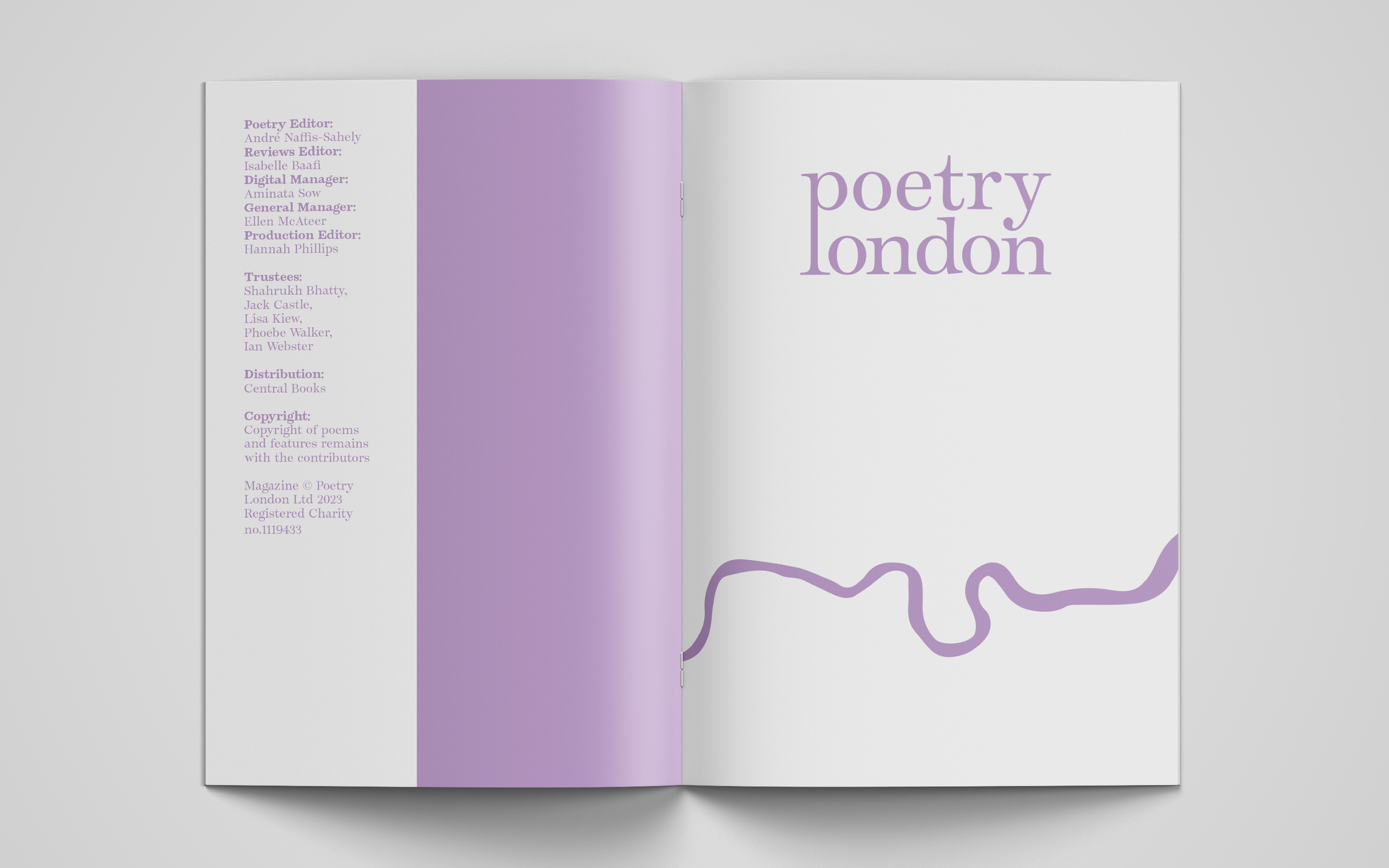
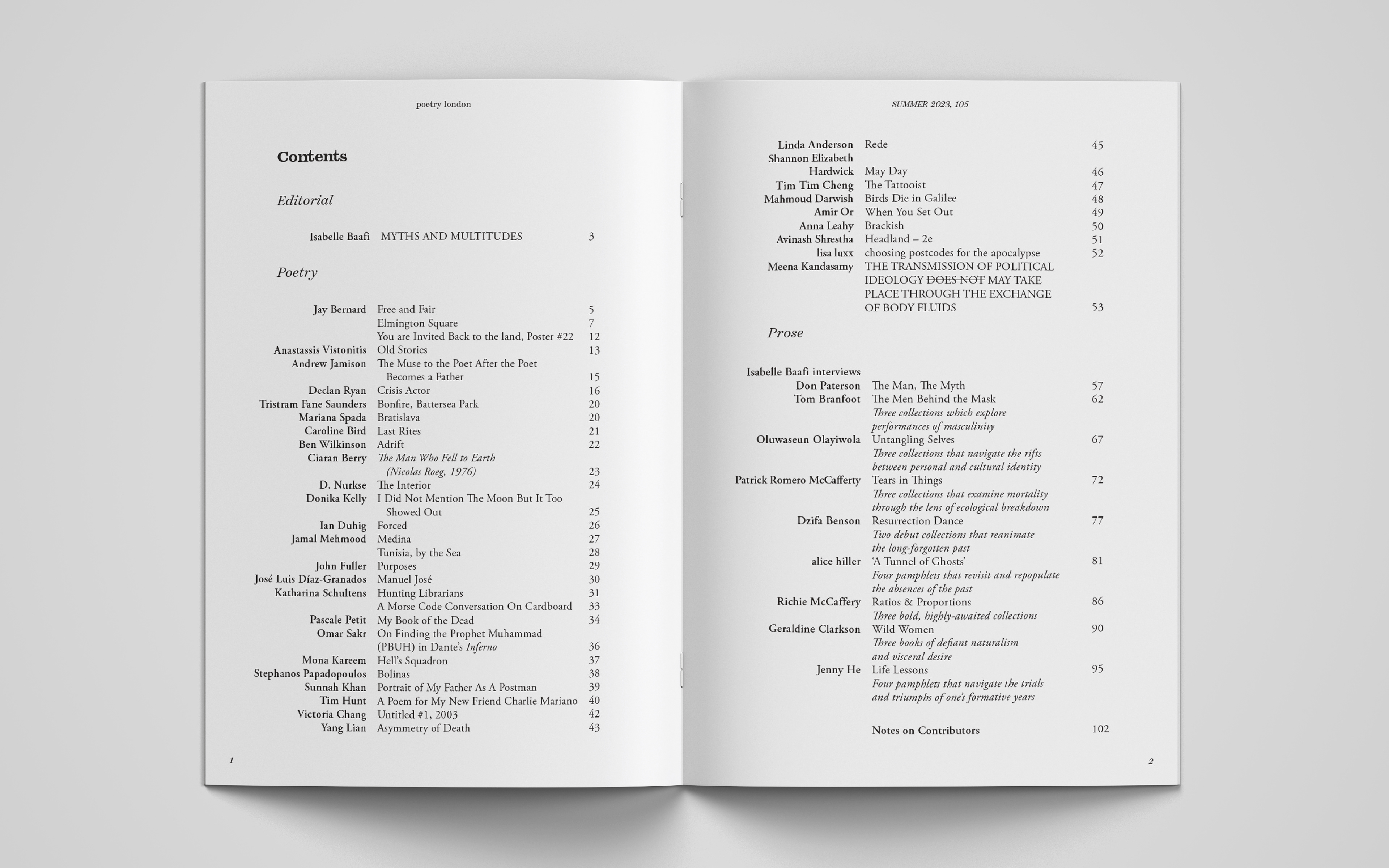
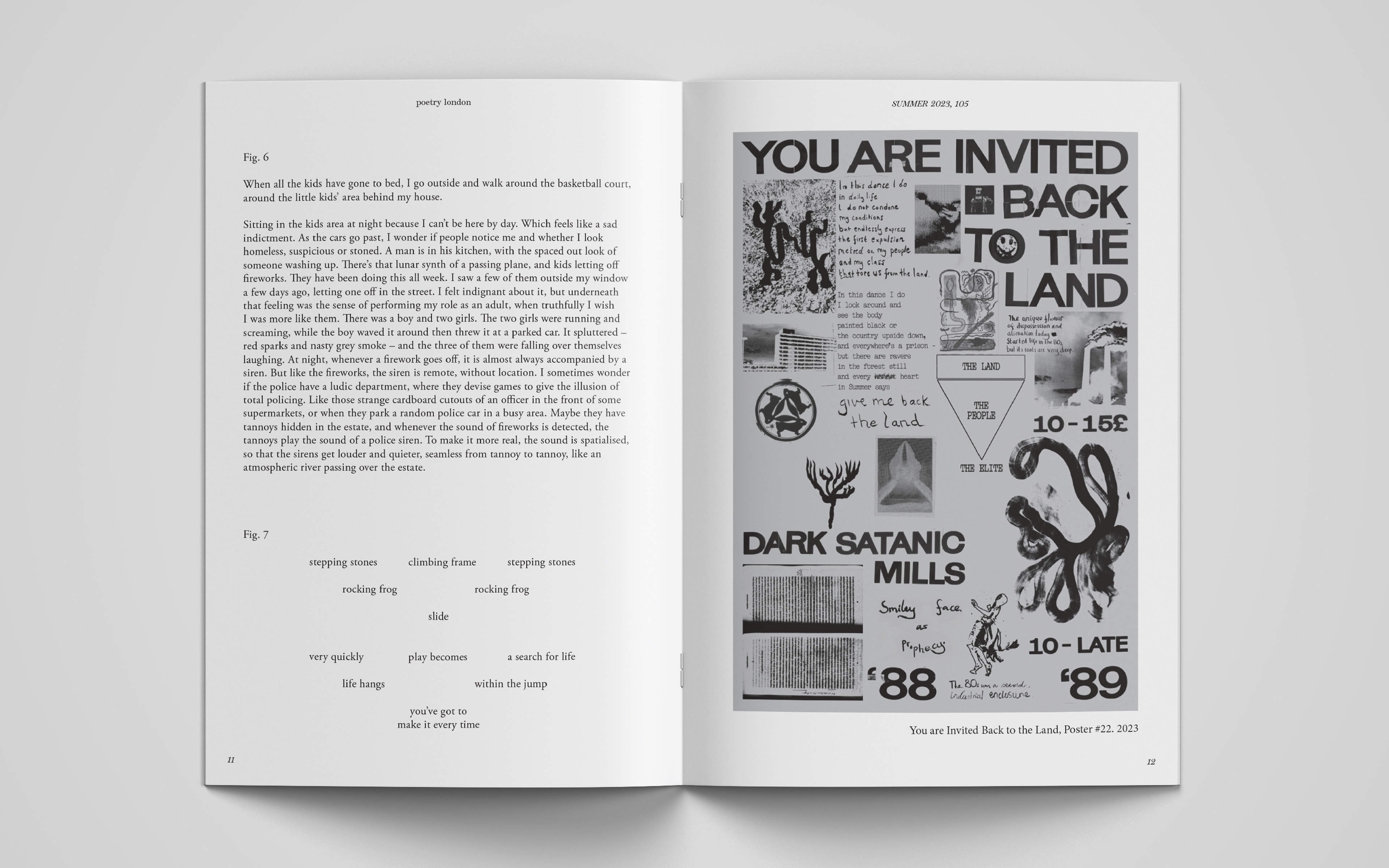
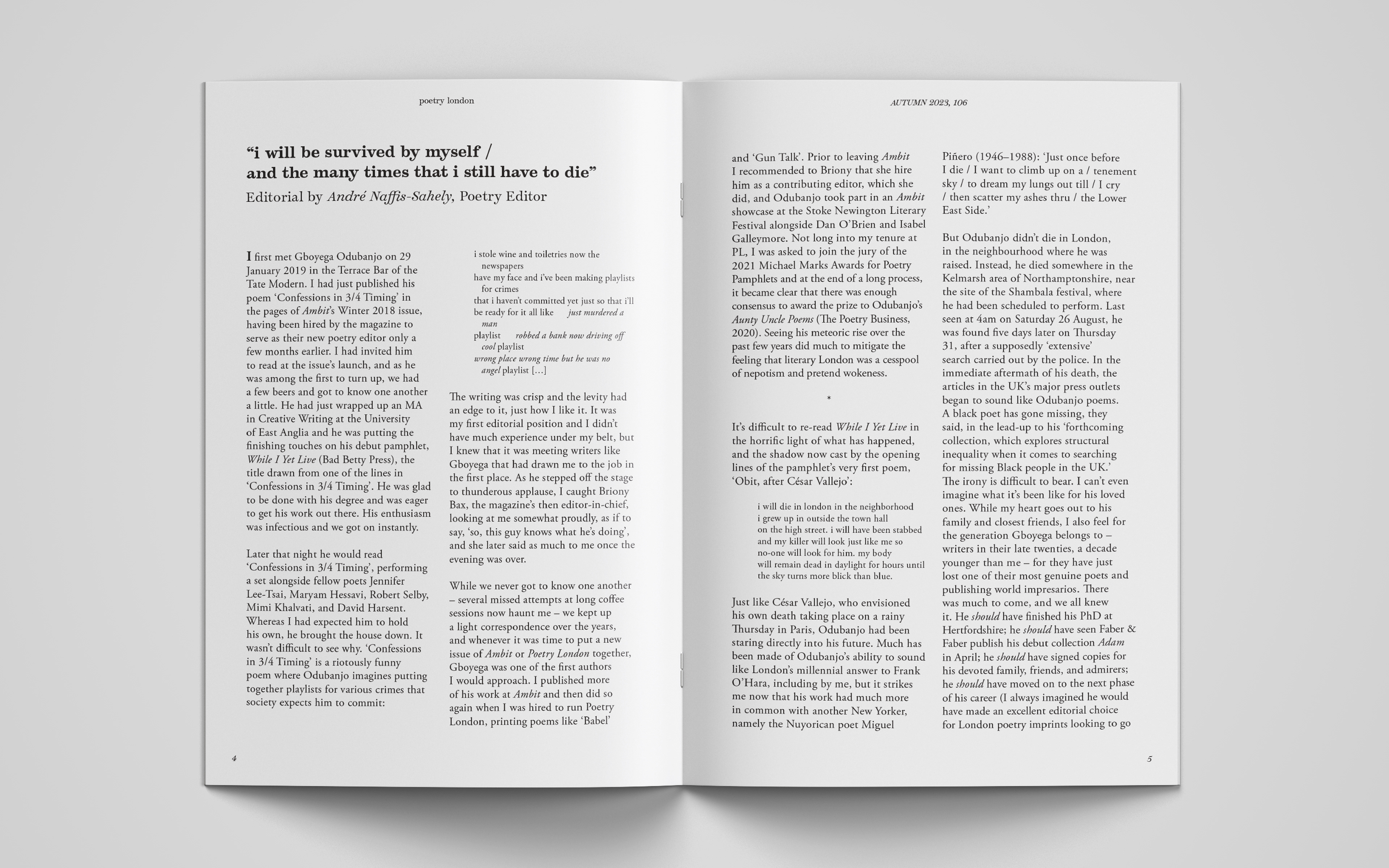
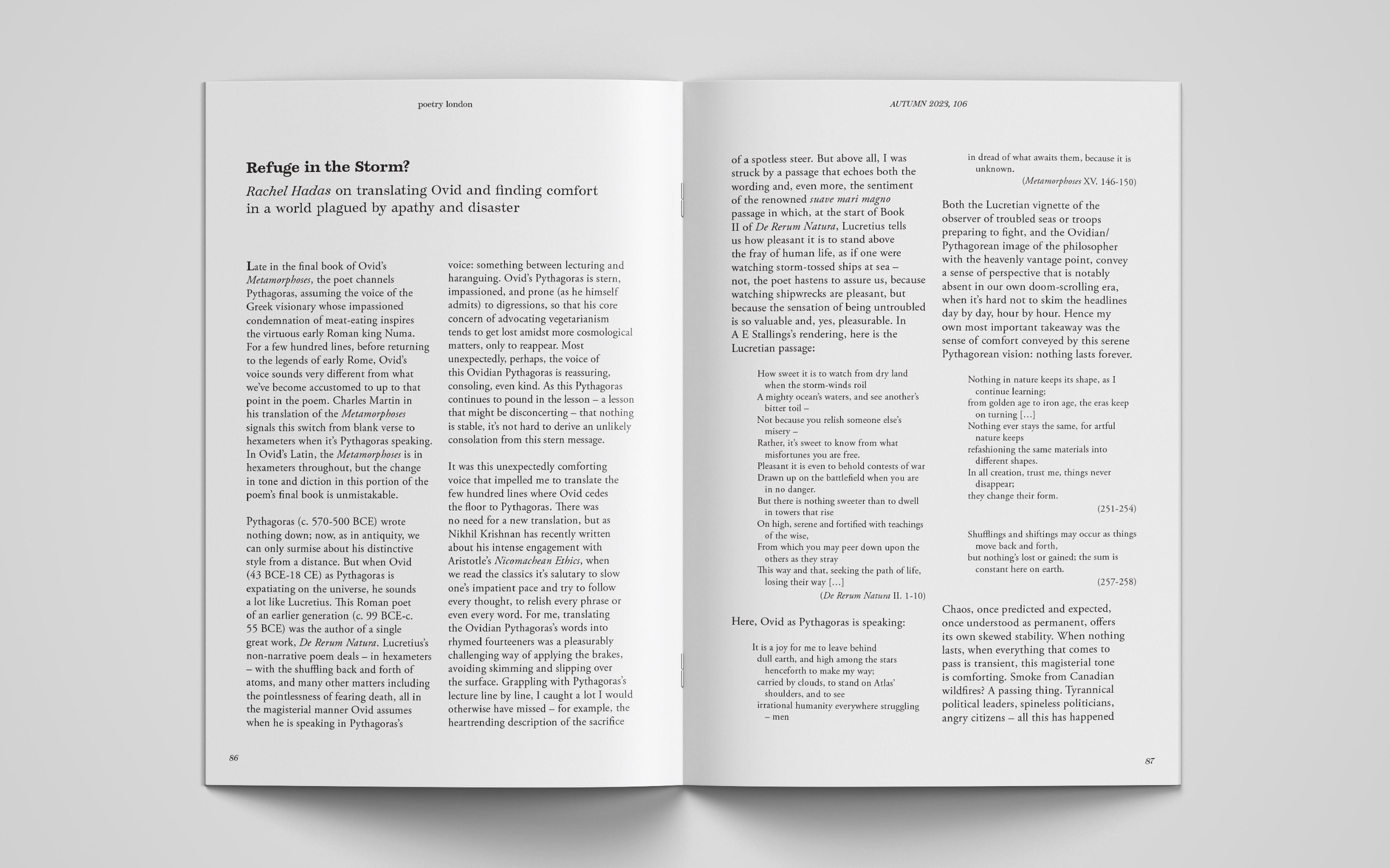
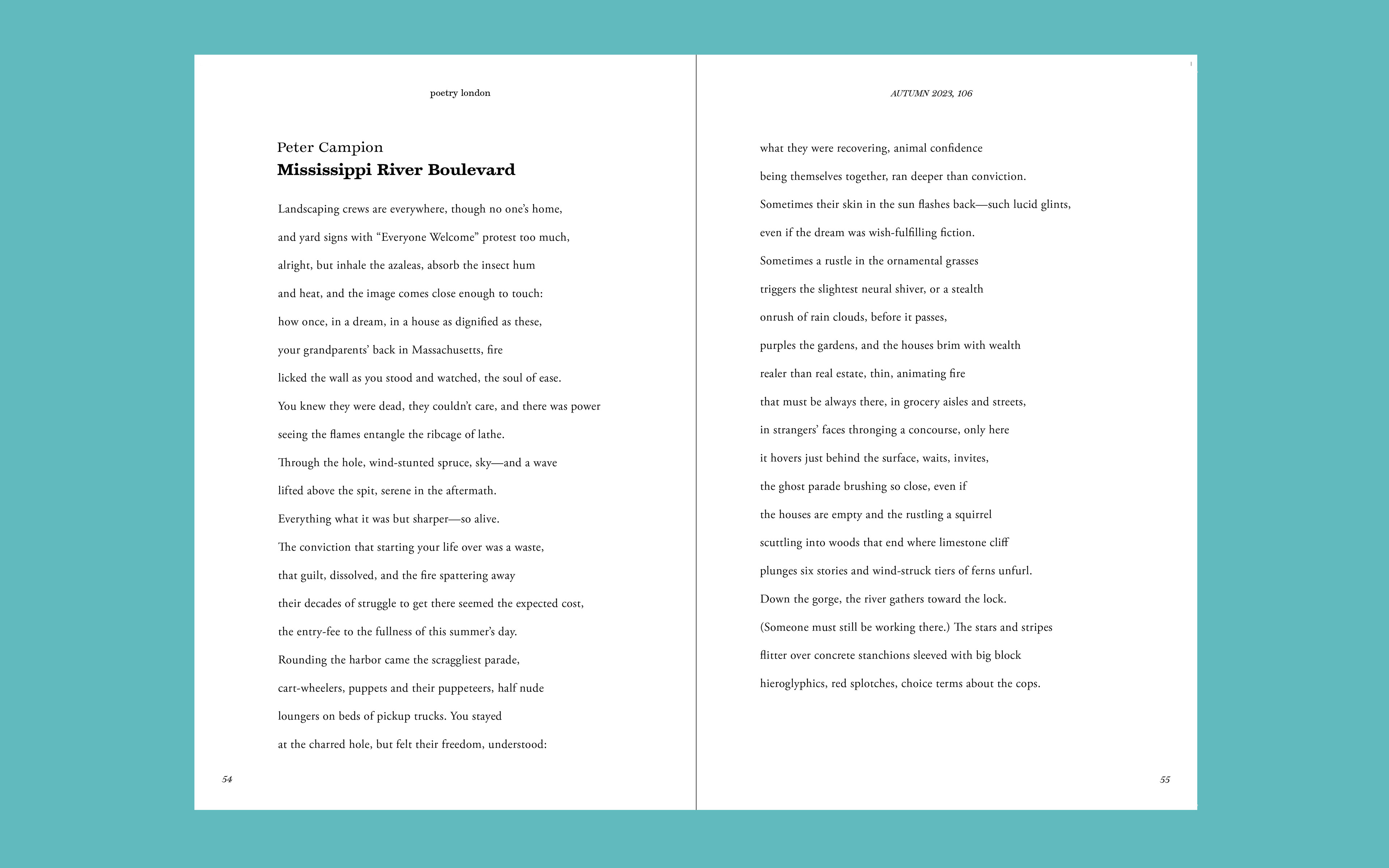
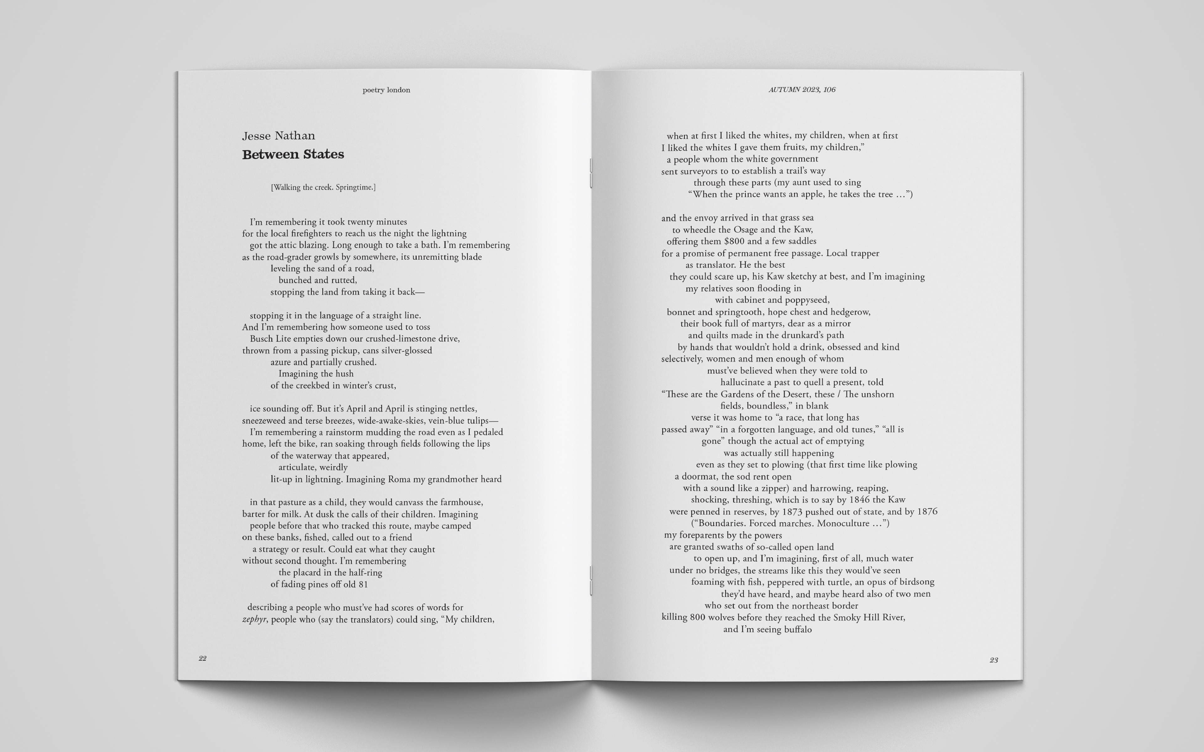
I used previous editions from the 90s and early 2000s as inspiration for the magazine layout, honing a wordmark that had a refined typeface at its heart but also conveyed the sense of connection and 'reaching out' that poetry can , with the ligature and joining of the 'p' and the 'l'. With a we hoped to stand out from other publications in the market, creating a distinct format and eye-catching look. My work with the Poetry London team is ongoing as I typeset each edition of the magazine, and am currently developing some visual directions for both the 'editions' and 'collections' of poetry, which will be launched by Poetry London in 2024.